https://css-tricks.com/mega-list-svg-information/
<svg   height='200'>
  <g transform="translate(10 50) rotate(-30)">
    <!-- 移动 (10,50) 旋转 -30  -->
    <rect x='50' y='50'     fill='red' stroke='#000' stroke-width='5'>
      <!-- x,y 位置  width,height 矩形的宽高  fill 填充的颜色  stroke 边框的颜色  stroke-width 边框的宽度 -->
    </rect>
  </g>
</svg>

rx='10' ry='10'
圆角
视区盒子
viewBox="x, y, width, height"
// x:左上角横坐标,y:左上角纵坐标,宽度,height:高度
<svg       viewBox="0,0,100,100">

   相当于在 0,0 的位置 把svg缩小了一倍
  <circle cx="50" cy="60" r="50"/>
      cx,cy  圆点
      r 半径
<svg     style="border:1px solid #cd0000;margin: 100px">
  <ellipse rx="10" ry="50" fill="none" stroke="red" stroke-  transform="translate(100,100)"></ellipse>
</svg>
<svg     style="border:1px solid #cd0000;margin: 100px">
  <g stroke="green">
    <line x1="100" y1="300" x2="400" y2="480" stroke-width="3"></line>
  </g>
</svg>
polygon多边形<svg style="border:1px solid #cd0000;margin: 100px"> <polyline fill="none" stroke="blue" stroke- points="50 50,400 20,300 200," /> </svg>
<svg     style="border:1px solid #cd0000;margin: 100px">
  <polygon points="20 30,50 60,350 100" fill="red" stroke="blue" stroke-width="2"></polygon>
</svg>
例子
M 100,200 L 400,300
M 100,200 L 400,300 L 123,44
<svg     style="border:1px solid #cd0000;margin: 100px">
  <path d="路径" pathLenth="非负数"/>
      // path 计算路径长度
</svg>
大小写
大写 M 绝对定位
小写 m 相对定位
(M m) 移动到新位置
(L l) 从当前坐标到新坐标绘制一条线
(H h) 将线绘制到新的水平坐标
(V v) 将线绘制新的垂直坐标
(Z z) 关闭当前路径
<svg     style="border:1px solid #cd0000;margin: 100px">
  <path d="M 50 50 L 0 300 L 200 200 V 50 H 40 L300 300 L 300 200 Z" fill="none" stroke-  stroke="red"/>
</svg>
有三组命令绘制弯曲的路径: 三次贝塞尔曲线(C,S),二次贝塞尔曲线(Q,T) 和椭圆弧(A)
C
三次贝塞尔曲线(x1,y1,x2,y2,x,y)
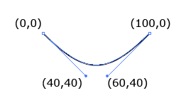
<path d="M0 0 C40 40,60 40,100,0" stroke="black" fill="none"/>
S
在原本的点后方建立一个带有贝塞尔曲线
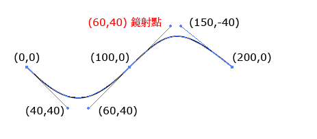
<path d="M0 0 C40 40,60 40,100,0 S150 -40, 200 0" stroke="black" fill="none"/>
Q
Q简单些, 起点和终点的贝塞尔曲线公用一个控制点,只需要提供贝塞尔控制点坐标和终点坐标
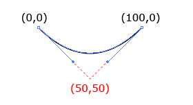
<path d="M0 0 Q50 50, 100 0" stroke="black" fill="none"/>
T
只有一组参数x,y ,表示终点的坐标,所以T的前方接上Q,才能画出对应的坐标线
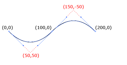
<path d="M0 0 Q50 50, 100 0 T200 0" stroke="black" fill="none"/>
A
工具网址https://mavo.io/demos/svgpath/
椭圆弧(rx,ry,x-axis-rotation,large-arc-flag, sweep-flag)
- rx : 椭圆的x 轴半径( 根据不同的终点换算成比例 )
- ry : 椭圆的y 轴半径( 根据不同的终点换算成比例 )
- x-axis-rotation : 弧线与x 轴的夹角
- large-arc-flag : 1 为大角度弧线,0 为小角度弧线( 必须有三个点 )
- sweep-flag : 1 为顺时针方向,0 为逆时针方向
- x : 终点x 座标
- y : 终点y 座标
path太复杂了,我这种小可爱理解有点困难
线上网址
https://jxnblk.github.io/paths/
- stroke:边框的颜色
- stroke-width:边框的宽度
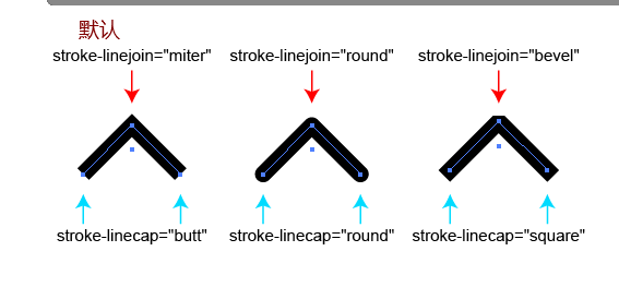
- stroke-linecap:边框端点的属性( butt (预设)、square、round )
- stroke-linejoin:边框接合尖角的属性( miter (预设)、round、bevel )
- stroke-dasharray:虚线
<polyline fill="none" stroke="#000000" stroke-  stroke-linecap="round" stroke-linejoin="round" points="193.546,119.133
    223.245,89.434 252.943,119.133 "/>
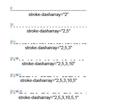
<line fill="none" stroke="#000000" stroke-dasharray="2" x1="0" y1="0" x2="100" y2="0"/>
<rect x="290" y="50" stroke="#000" stroke- fill="#09f"></rect>
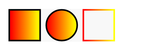
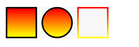
渐变
左到右
<defs>
   <linearGradient id="a1">
     <stop offset="5%" stop-color="#F00" />
     <stop offset="95%" stop-color="#ff0" />
   </linearGradient>
</defs>
<rect x="50" y="250"     stroke="#000" stroke-  fill="url(#a1)"></rect>
<circle cx="220" cy="300" r="50" stroke="#000" stroke-  fill="url(#a1)"></circle>
<rect x="290" y="250"     stroke="url(#a1)" stroke-  fill="none"></rect>
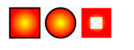
放射状
<defs>
   <radialGradient id="a1">
     <stop offset="5%" stop-color="#ff0" />
     <stop offset="95%" stop-color="#f00" />
   </radialGradient>
</defs>
垂直渐变
<defs>
   <linearGradient   x1="0%" y1="0%" x2="0%" y2="100%">
     <stop offset="5%" stop-color="#F00" />
     <stop offset="95%" stop-color="#ff0" />
   </linearGradient>
</defs>
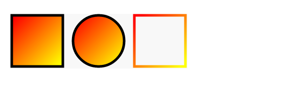
倾斜渐变
<defs>
   <linearGradient   x1="0%" y1="0%" x2="100%" y2="100%">
     <stop offset="5%" stop-color="#F00" />
     <stop offset="95%" stop-color="#ff0" />
   </linearGradient>
</defs>
修改中心点的渐变
<defs>
   <radialGradient   cx="20%" cy="40%">
     <stop offset="5%" stop-color="#ff0" />
     <stop offset="95%" stop-color="#f00" />
   </radialGradient>
</defs>

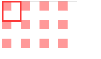
pattern
用于fill
通过x轴或y轴方向以固定间隔平铺,然后通过id引用
属性
- patternUnits = "userSpaceOnUse | objectBoundingBox"
- patternContentUnits = "userSpaceOnUse | objectBoundingBox"
- patternTransform
- x
- y
- width
- height
- xlink:href
- preserveAspectRatio = "[defer] []"
patternUnits=userSpaceOnUse
表示以使用者的坐标为主
<svg     >
  <defs>
    <pattern   patternUnits="userSpaceOnUse"   height="60">
      <rect     fill="#f99" x="0" y="0"/>
    </pattern>
  </defs>
  <rect     fill="url(#p)" stroke="#aaa" />
</svg>
完整版,你可以把每一个注释下,方便自己理解
<svg     >
  <defs>
    <pattern   patternUnits="userSpaceOnUse"   height="60">
      <rect     fill="#f99" x="0" y="0"/>
    </pattern>
  </defs>
  <rect     fill="url(#p)" stroke="#aaa" />
  <circle cx="150" cy="80" r="50" stroke="#000" fill="url(#p)" />
  <rect     x="1" y="1" stroke="#00f" stroke-  fill="url(#p)" />
</svg>
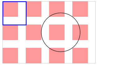
优先级从上到下一次递增的
<defs>
  <pattern   patternUnits="userSpaceOnUse"   height="40">
    <rect     fill="#f99" x="30" y="0"></rect>
  </pattern>
</defs>
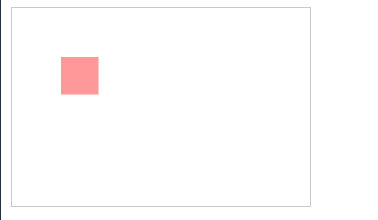
我们会发现当我们把pattern里的rect,位置超过了pattern 的范围,就会发现rect会被裁剪
patternUnits=userSpaceOnUse
设置是以我们画出来的形状为基准, 设置pattern长宽,就变成了比例而不是数值
如果宽高为1,1 那么画出来的就是等于图形长宽
<svg     >
  <defs>
    <pattern   patternUnits="objectBoundingBox"   height="1">
      <rect     fill="#f99" x="40" y="40"/>
    </pattern>
  </defs>
  <!-- 长宽比 1:1-->
  <rect     fill="url(#p)" stroke="#aaa" />
   <!--x=40,y=40,w30h30 fill #f99 填充一个小矩形-->
</svg>
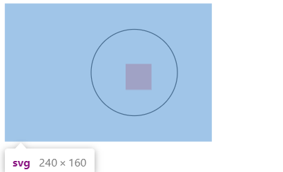
<svg     >
  <defs>
    <pattern   patternUnits="objectBoundingBox"   height="1">
      <rect     fill="#f99" x="40" y="40"/>
    </pattern>
  </defs>
  <!-- 长宽比 1:1-->
  <circle cx="150" cy="80" r="50" stroke="#000" fill="url(#p)" />
    <!--
           那么这个元素的起步位置原点应该是 100,30
           由于x=40,y=40
           所以 填充的矩形的其实位置是140,70
    -->
</svg>
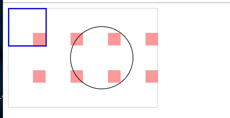
<svg   height="160">
  <defs>
    <pattern   patternUnits="objectBoundingBox"   height="1">
      <rect     fill="#f99" x="0" y="0"/>
    </pattern>
  </defs>
  <!-- 长宽比 1:1-->
  <rect     stroke-  stroke="red"  fill="url(#p)" x="20" y="20"/>
   <circle r="30" cx="200" cy="80" fill="url(#p)" stroke-  stroke="red"/>
</svg>
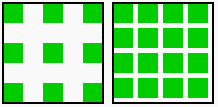
如果把width设为.4, height设置为0.4,那么在100*100的图形中,则是40 * 40 的pattern,
如果rect 为 width 30 height 30 则背景图案是带有10的宽度间距的重复图案
<svg   height="160">
  <defs>
    <pattern   patternUnits="objectBoundingBox"   height=".4">
      <rect     fill="#f99" x="0" y="0"></rect>
    </pattern>
  </defs>
  <circle cx="180" cy="80" r="50" stroke="#0a0" stroke-  fill="url(#p)" />
  <rect     x="10" y="30" stroke="#000" stroke-  fill="url(#p)" />
</svg>
不同的矩形的套用,出来的结果不同
<svg   height="160">
  <defs>
    <pattern   patternUnits="objectBoundingBox"   height=".4">
      <rect     fill="#f99" x="0" y="0"></rect>
    </pattern>
  </defs>
  <rect     x="120" y="30" stroke="#000"  stroke-  fill="url(#p)" />
  <rect     x="10" y="30" stroke="#000" stroke-  fill="url(#p)" />
</svg>
设定为userSpaceOnUse实际的宽度的高度: 比例乘上实际套用的图像的长/宽
当为width/height 80px 80*0.4=32 由于他们每一个宽度是30那么空隙就是2
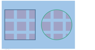
patternTransform
让我们直接对pattern 下大 transform
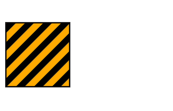
倾斜45度
<svg   height="160">
  <defs>
    <pattern   patternUnits="objectBoundingBox"     patternTransform="rotate(45)">
      <rect     fill="#000" x="0" y="0"></rect>
      <rect     fill="#fa0" x="10" y="0"></rect>
    </pattern>
  </defs>

  <rect     x="10" y="30" stroke="#000" stroke-  fill="url(#p1)" />
</svg>
要记得的点在于userSpaceOnUse 就是标准的长度数值,objectBoundingBox 就是比例
xlink:href
二次引入
<defs>
  <pattern id="r1">
    <rect     fill="#0c0" x="0" y="0"></rect>
  </pattern>
  <pattern   patternUnits="objectBoundingBox"     xlink:href="https://tool.4xseo.com/article/159562.html" />
  <pattern   patternUnits="objectBoundingBox"     xlink:href="https://tool.4xseo.com/article/159562.html" />
</defs>

<rect     x="10" y="30" stroke="#000" stroke-  fill="url(#p1)" />
<rect     x="120" y="30" stroke="#000" stroke-  fill="url(#p2)" />
把一些重复利用的物体放在defs元素内
再use 把元素呈现出来
use 的属性有 x,y 的坐标
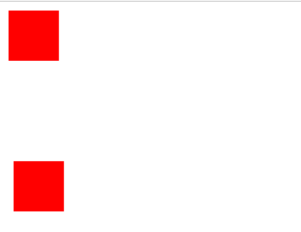
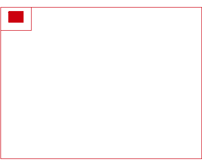
<svg     >
<defs>
  <rect       x="10" y="10" fill="red"/>
</defs>
<use xlink:href="https://tool.4xseo.com/article/159562.html"/>
<use xlink:href="https://tool.4xseo.com/article/159562.html" x="10" y="300"/>
</svg>