摘要:
0.更改模板效果:代码:˂SolidColorBrushx:Name=“m_Stroke
0、更改模板
效果:


代码:
        <Button x:Name="m_HelpButton"IsEnabled="True"Width="23"Height="23"Click="m_HelpButton_Click">
            <Button.Template>
                <ControlTemplate>
                    <Grid>
                        <Ellipse>
                            <Ellipse.Stroke>
                                <SolidColorBrush x:Name="m_Stroke"Color="Silver" />
                            </Ellipse.Stroke>
                            <Ellipse.Fill>
                                <SolidColorBrush x:Name="m_Back"Color="White" />
                            </Ellipse.Fill>
                        </Ellipse>
                        <Image Margin="2"Source="Image/help1.png" />
                    </Grid>
                    <ControlTemplate.Triggers>
                        <Trigger Property="Button.IsMouseOver"Value="True">
                            <Trigger.EnterActions>
                                <BeginStoryboard>
                                    <Storyboard>
                                        <ColorAnimation To="LightBlue"BeginTime="0:0:0.1"Duration="0:0:0.1"Storyboard.TargetName="m_Stroke"Storyboard.TargetProperty="Color" />
                                    </Storyboard>
                                </BeginStoryboard>
                            </Trigger.EnterActions>
                            <Trigger.ExitActions>
                                <BeginStoryboard>
                                    <Storyboard>
                                        <ColorAnimation To="Silver"BeginTime="0:0:0.1"Duration="0:0:0.1"Storyboard.TargetName="m_Stroke"Storyboard.TargetProperty="Color" />
                                    </Storyboard>
                                </BeginStoryboard>
                            </Trigger.ExitActions>
                        </Trigger>
                        <Trigger Property="Button.IsPressed"Value="True">
                            <Trigger.EnterActions>
                                <BeginStoryboard>
                                    <Storyboard>
                                        <ColorAnimation To="LightBlue"BeginTime="0:0:0"Duration="0:0:0.1"Storyboard.TargetName="m_Back"Storyboard.TargetProperty="Color" />
                                    </Storyboard>
                                </BeginStoryboard>
                            </Trigger.EnterActions>
                            <Trigger.ExitActions>
                                <BeginStoryboard>
                                    <Storyboard>
                                        <ColorAnimation To="White"BeginTime="0:0:0"Duration="0:0:0.1"Storyboard.TargetName="m_Back"Storyboard.TargetProperty="Color" />
                                    </Storyboard>
                                </BeginStoryboard>
                            </Trigger.ExitActions>
                        </Trigger>
                        <Trigger Property="Button.IsEnabled"Value="False">
                            <Trigger.EnterActions>
                                <BeginStoryboard>
                                    <Storyboard>
                                        <ColorAnimation To="Silver"BeginTime="0:0:0"Duration="0:0:0"Storyboard.TargetName="m_Back"Storyboard.TargetProperty="Color" />
                                    </Storyboard>
                                </BeginStoryboard>
                            </Trigger.EnterActions>
                            <Trigger.ExitActions>
                                <BeginStoryboard>
                                    <Storyboard>
                                        <ColorAnimation To="Silver"BeginTime="0:0:0"Duration="0:0:0"Storyboard.TargetName="m_Back"Storyboard.TargetProperty="Color" />
                                    </Storyboard>
                                </BeginStoryboard>
                            </Trigger.ExitActions>
                        </Trigger>
                    </ControlTemplate.Triggers>
                </ControlTemplate>
            </Button.Template>
        </Button>
1、原生态
效果:

代码:
 <Button Height="23" HorizontalAlignment="Left" Margin="57,40,0,0" Name="button1" VerticalAlignment="Top" Width="75">
            <Button.Content>
                <StackPanel Orientation="Horizontal">
                    <Image Stretch="Fill" Source="/WpfApplication1;component/Images/previous.png" />
                    <TextBlock Text="Next" />
                    <Image Stretch="Fill" Source="/WpfApplication1;component/Images/next.png" />
                </StackPanel>
            </Button.Content>
        </Button>
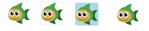
2、去边框图片按钮
示意图:
自定义控件源码
xaml
<UserControl x:Class="Fish.UILayer.Component.ImageButtonUC"xmlns="http://schemas.microsoft.com/winfx/2006/xaml/presentation"xmlns:x="http://schemas.microsoft.com/winfx/2006/xaml"xmlns:mc="http://schemas.openxmlformats.org/markup-compatibility/2006"xmlns:d="http://schemas.microsoft.com/expression/blend/2008"mc:Ignorable="d"d:DesignHeight="23"d:DesignWidth="23"IsEnabledChanged="UserControl_IsEnabledChanged"MouseEnter="UserControl_MouseEnter"MouseLeave="UserControl_MouseLeave"MouseDown="UserControl_MouseDown"MouseUp="UserControl_MouseUp">
    <Border x:Name="m_Border"BorderThickness="1"CornerRadius="5"Background="White">
        <Rectangle Margin="2">
            <Rectangle.Fill>
                <ImageBrush x:Name="m_ImageBrush"  />
            </Rectangle.Fill>
        </Rectangle>
    </Border>
</UserControl>
cs
usingSystem;
usingSystem.Collections.Generic;
usingSystem.Linq;
usingSystem.Text;
usingSystem.Windows;
usingSystem.Windows.Controls;
usingSystem.Windows.Data;
usingSystem.Windows.Documents;
usingSystem.Windows.Input;
usingSystem.Windows.Media;
usingSystem.Windows.Media.Imaging;
usingSystem.Windows.Navigation;
usingSystem.Windows.Shapes;

namespaceFish.UILayer.Component
{
    /// <summary>
    ///ImageUC.xaml 的交互逻辑
    /// </summary>
    public partial classImageButtonUC : UserControl
    {
        private Brush DOWN_BRUSH = newSolidColorBrush(Colors.Blue);
        private Brush SELECT_BRUSH = newSolidColorBrush(Colors.LightBlue);
        private Brush UNSELECT_BRUSH = newSolidColorBrush(Colors.White);
        private Brush DISABLED_BRUSH = newSolidColorBrush(Colors.LightGray);

        public eventMouseButtonEventHandler ClickEvent;

        publicImageSource MyImage
        {
            get { returnm_ImageBrush.ImageSource; }
            set { m_ImageBrush.ImageSource =value; }
        }

        publicImageButtonUC()
        {
            InitializeComponent();
        }

        private void UserControl_IsEnabledChanged(objectsender, DependencyPropertyChangedEventArgs e)
        {
            //if (this.IsEnabled == true)
            //{
            //m_Border.Background = UNSELECT_BRUSH;
            //}
            //else
            //{
            //m_Border.Background = DISABLED_BRUSH;
            //}
}
        private void UserControl_MouseEnter(objectsender, MouseEventArgs e)
        {
            if (this.IsEnabled == true)
            {
                m_Border.BorderBrush =SELECT_BRUSH;
            }
        }
        private void UserControl_MouseLeave(objectsender, MouseEventArgs e)
        {
            if (this.IsEnabled == true)
            {
                m_Border.BorderBrush =UNSELECT_BRUSH;
            }
        }
        private void UserControl_MouseDown(objectsender, MouseButtonEventArgs e)
        {
            if (this.IsEnabled == true)
            {
                m_Border.Background =SELECT_BRUSH;
            }
        }
        private void UserControl_MouseUp(objectsender, MouseButtonEventArgs e)
        {
            if (this.IsEnabled == true)
            {
                m_Border.Background =UNSELECT_BRUSH;
                if (ClickEvent != null)
                {
                    ClickEvent(sender, e);
                }
            }
        }


    }
}
使用源码:
<component:ImageButtonUC x:Name="m_LogoImageButtonUC"Height="75"Width="75"MyImage="/Fish.UILayer;component/Images/Fish.png"Grid.Column="2"Grid.Row="1"Grid.RowSpan="3"ClickEvent="m_LogoImageButtonUC_ClickEvent" />
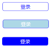
3、纯文字按钮
效果图:
自定义控件
XAML
<UserControl x:Class="Fish.UILayer.Component.SampleButtonUC"xmlns="http://schemas.microsoft.com/winfx/2006/xaml/presentation"xmlns:x="http://schemas.microsoft.com/winfx/2006/xaml"xmlns:mc="http://schemas.openxmlformats.org/markup-compatibility/2006"xmlns:d="http://schemas.microsoft.com/expression/blend/2008"mc:Ignorable="d"d:DesignHeight="28"d:DesignWidth="150"IsEnabledChanged="UserControl_IsEnabledChanged"MouseEnter="UserControl_MouseEnter"MouseLeave="UserControl_MouseLeave"MouseDown="UserControl_MouseDown"MouseUp="UserControl_MouseUp">
    <Border x:Name="m_Border"BorderBrush="Blue"BorderThickness="1"CornerRadius="5"Background="White">
        <TextBlock x:Name="m_TextBlock"Text="Button"Foreground="Blue"FontSize="16"VerticalAlignment="Center"HorizontalAlignment="Center"/>
    </Border>
</UserControl>
CS
usingSystem;
usingSystem.Collections.Generic;
usingSystem.Linq;
usingSystem.Text;
usingSystem.Windows;
usingSystem.Windows.Controls;
usingSystem.Windows.Data;
usingSystem.Windows.Documents;
usingSystem.Windows.Input;
usingSystem.Windows.Media;
usingSystem.Windows.Media.Imaging;
usingSystem.Windows.Navigation;
usingSystem.Windows.Shapes;

namespaceFish.UILayer.Component
{
    /// <summary>
    ///SampleButtonUC.xaml 的交互逻辑
    /// </summary>
    public partial classSampleButtonUC : UserControl
    {
        private Brush DOWN_BRUSH = newSolidColorBrush(Colors.Blue);
        private Brush SELECT_BRUSH = newSolidColorBrush(Colors.LightBlue);
        private Brush UNSELECT_BRUSH = newSolidColorBrush(Colors.White);
        private Brush DISABLED_BRUSH = newSolidColorBrush(Colors.LightGray);

        public eventMouseButtonEventHandler ClickEvent;

        public stringText
        {
            get { returnm_TextBlock.Text; }
            set { m_TextBlock.Text =value; }
        }
        public doubleTextFontSize
        {
            get { returnm_TextBlock.FontSize; }
            set { m_TextBlock.FontSize =value; }
        }
        publicCornerRadius CornerRadius
        {
            get { returnm_Border.CornerRadius; }
            set { m_Border.CornerRadius =value; }
        }

        publicSampleButtonUC()
        {
            InitializeComponent();
        }
        private void UserControl_IsEnabledChanged(objectsender, DependencyPropertyChangedEventArgs e)
        {
            if (this.IsEnabled == true)
            {
                m_Border.Background =UNSELECT_BRUSH;
                m_TextBlock.Foreground =DOWN_BRUSH;
            }
            else{
                m_Border.Background =DISABLED_BRUSH;
                m_TextBlock.Foreground =UNSELECT_BRUSH;
            }
        }
        private void UserControl_MouseEnter(objectsender, MouseEventArgs e)
        {
            if (this.IsEnabled == true)
            {
                m_Border.Background =SELECT_BRUSH;
                m_TextBlock.Foreground =UNSELECT_BRUSH;
            }
        }
        private void UserControl_MouseLeave(objectsender, MouseEventArgs e)
        {
            if (this.IsEnabled == true)
            {
                m_Border.Background =UNSELECT_BRUSH;
                m_TextBlock.Foreground =DOWN_BRUSH;
            }
        }
        private void UserControl_MouseDown(objectsender, MouseButtonEventArgs e)
        {
            if (this.IsEnabled == true)
            {
                m_Border.Background =DOWN_BRUSH;
                m_TextBlock.Foreground =UNSELECT_BRUSH;
            }
        }
        private void UserControl_MouseUp(objectsender, MouseButtonEventArgs e)
        {
            if (this.IsEnabled == true)
            {
                m_Border.Background =SELECT_BRUSH;
                m_TextBlock.Foreground =UNSELECT_BRUSH;
                if (ClickEvent != null)
                {
                    ClickEvent(sender, e);
                }
            }
        }


    }
}
使用:
<component:SampleButtonUC x:Name="m_LoginButton"Text="登录"TextFontSize="16"ClickEvent="m_LoginButton_ClickEvent"Width="150"Height="28" />
其他效果待补充