摘要:
'is checked':aria checked=“checked”:true value=“activeValue”:false value=“inactiveValue”:disabled=“switchDisabled”@keydown。enter=“switchValue”>:spanref=“core”;style=“{'width';coreWidth+'px'}”>
源码如下:
<template>
  <div

    :class="{ 'is-disabled': switchDisabled, 'is-checked': checked }"
    role="switch"
    :aria-checked="checked"
    :aria-disabled="switchDisabled"
    @click="switchValue"
  >
    <input

      type="checkbox"
      @change="handleChange"
      ref="input"
      :
      :name="name"
      :true-value="activeValue"
      :false-value="inactiveValue"
      :disabled="switchDisabled"
      @keydown.enter="switchValue"
    >

    <span
      :class="['el-switch__label', 'el-switch__label--left', !checked ? 'is-active' : '']"
      v-if="inactiveIconClass || inactiveText">
      <i :  v-if="inactiveIconClass"></i>
      <span v-if="!inactiveIconClass && inactiveText" :aria-hidden="checked">{{ inactiveText }}</span>
    </span>

    <span   ref="core" :style="{ 'width': coreWidth + 'px' }"></span>

    <span
      :class="['el-switch__label', 'el-switch__label--right', checked ? 'is-active' : '']"
      v-if="activeIconClass || activeText">
      <i :  v-if="activeIconClass"></i>
      <span v-if="!activeIconClass && activeText" :aria-hidden="!checked">{{ activeText }}</span>
    </span>
  </div>
</template>
<script>
  import Focus from 'element-ui/src/mixins/focus';
  import Migrating from 'element-ui/src/mixins/migrating';

  export default {
    name: 'ElSwitch',
    mixins: [Focus('input'), Migrating],
    //  注入elForm对象,防止不和el-form使用时对象不存在的问题。
    inject: {
      elForm: {
        default: ''
      }
    },
    props: {
      value: {
        type: [Boolean, String, Number],
        default: false
      },
      disabled: { //是否禁用
        type: Boolean,
        default: false
      },
       { //switch 的宽度(像素)
        type: Number,
        default: 40
      },
      activeIconClass: { //switch 打开时所显示图标的类名,设置此项会忽略 active-text
        type: String,
        default: ''
      },
      inactiveIconClass: { //switch 关闭时所显示图标的类名,设置此项会忽略 inactive-text
        type: String,
        default: ''
      },
      activeText: String, //switch 打开时的文字描述
      inactiveText: String, //switch 关闭时的文字描述
      activeColor: { //switch 打开时的背景色
        type: String,
        default: ''
      },
      inactiveColor: { //switch 关闭时的背景色
        type: String,
        default: ''
      },
      activeValue: { //switch 打开时的值
        type: [Boolean, String, Number],
        default: true
      },
      inactiveValue: { //switch 关闭时的值
        type: [Boolean, String, Number],
        default: false
      },
      name: { //switch 对应的 name 属性
        type: String,
        default: ''
      },
      id: String
    },
    data() {
      return {
        coreWidth: this.width
      };
    },
    created() {
      if (!~[this.activeValue, this.inactiveValue].indexOf(this.value)) {
        this.$emit('input', this.inactiveValue);
      }
    },
    computed: {
        //当前的开关组件的状态
        checked() {
            //父组件中v-model绑定的值是否等于switch 打开时的值
            return this.value === this.activeValue;
        },
        //当前组件是否被禁用
      switchDisabled() {
        return this.disabled || (this.elForm || {}).disabled;
      }
    },
    watch: {
      checked() {
        this.$refs.input.checked = this.checked;
        //在用户设置了active-color和inactive-color时,通过setBackgroundColor设置开关的背景色
        if (this.activeColor || this.inactiveColor) {
          this.setBackgroundColor();
        }
      }
    },
    methods: {
      handleChange(event) {
        //!this.checked为true,则表示当前是this.value === this.inactiveValue,即为关着的状态;需要切换为开着的状态,返回this.activeValue
        this.$emit('input', !this.checked ? this.activeValue : this.inactiveValue);
        this.$emit('change', !this.checked ? this.activeValue : this.inactiveValue);
        this.$nextTick(() => {
            //修改value值并不是立即生效,而且为了防止父组件未修改值,这里进行了重复赋值
          this.$refs.input.checked = this.checked;
        });
      },
      //在用户设置了active-color和inactive-color时,点击切换开关时,根据this.checked的值设置开关的背景颜色
      setBackgroundColor() {
        //如果 this.checked为true,即当前switch是打开,开关返回打开时设置的背景色
        let newColor = this.checked ? this.activeColor : this.inactiveColor;
        this.$refs.core.style.borderColor = newColor;
        this.$refs.core.style.backgroundColor = newColor;
      },
      switchValue() {
        //在不禁用的状态下才能点击
        !this.switchDisabled && this.handleChange();
      },
      getMigratingConfig() {
        return {
          props: {
            'on-color': 'on-color is renamed to active-color.',
            'off-color': 'off-color is renamed to inactive-color.',
            'on-text': 'on-text is renamed to active-text.',
            'off-text': 'off-text is renamed to inactive-text.',
            'on-value': 'on-value is renamed to active-value.',
            'off-value': 'off-value is renamed to inactive-value.',
            'on-icon-class': 'on-icon-class is renamed to active-icon-class.',
            'off-icon-class': 'off-icon-class is renamed to inactive-icon-class.'
          }
        };
      }
    },
    mounted() {
      /* istanbul ignore if */
      this.coreWidth = this.width || 40;
      if (this.activeColor || this.inactiveColor) {
        this.setBackgroundColor();
      }
      this.$refs.input.checked = this.checked;
    }
  };
</script>
解析:
(1)组件的html结构
<div class="el-switch">
        <input   type="checkbox">
        <!--显示左边的标签-->
        <span class="el-switch__label el-switch__label--left">
             <i></i>
             <span></span>
        </span>
        <!--中间的开关-->
        <span class="el-switch__core"></span>
        <!--显示右边的标签-->
        <span class="el-switch__label el-switch__label--right">
            <i></i>
            <span></span>
         </span>
</div>
input标签被隐藏掉了,css部分代码如下:
.el-switch__input {
    position: absolute;
     0;
    height: 0;
    opacity: 0;
    margin: 0;
}
如果把上面的样式代码注释掉,如图所示: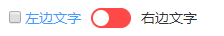
通过 <input type="checkbox"> 的checked属性来控制文字显示以及开关的状态切换。最外层包裹的div是为了能够通过点击文字也能切换开关状态。
(2)混入的 mixins: [Focus('input'), Migrating]
主要是migrating.js,该文件主要是用于开发环境下提示一些迁移或者即将修改的属性和方法的。
示例:我用的element-ui v2.4.9,我按下面这样写,off-text属性在我当前的版本中已经被改为inactive-text
<el-switch v-model="value2" off-text="关着"></el-switch>当我运行之后在控制台输出:
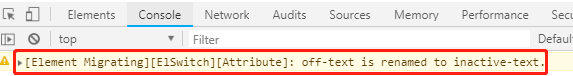
所有迁移的属性在组件的getMigratingConfig()方法中:
 getMigratingConfig() {
        return {
          props: {
            'on-color': 'on-color is renamed to active-color.',
            'off-color': 'off-color is renamed to inactive-color.',
            'on-text': 'on-text is renamed to active-text.',
            'off-text': 'off-text is renamed to inactive-text.',
            'on-value': 'on-value is renamed to active-value.',
            'off-value': 'off-value is renamed to inactive-value.',
            'on-icon-class': 'on-icon-class is renamed to active-icon-class.',
            'off-icon-class': 'off-icon-class is renamed to inactive-icon-class.'
          }
        };
      }
(3)created方法
 created() {
    //如果用户传入的v-model的值既不是activeValue也不是inactiveValue时,将inactiveValue传递出去,开关处于关状态
      if (!~[this.activeValue, this.inactiveValue].indexOf(this.value)) {
        this.$emit('input', this.inactiveValue);
      }
    },
~代表按位非运算符,如果[this.activeValue, this.inactiveValue].indexOf(this.value)为-1,则按位非后变为0。
参考博文:https://juejin.im/post/5b861db0e51d4538aa1b5630
http://www.zhuyuntao.cn/2018/10/24/element-ui-focus-js和migrating.js文件源码学习