翻译采用中英对照的方式.
原文地址:http://www.kymphillpotts.com/xamarin-forms-layout-challenges-timeline/
Github地址:https://github.com/kphillpotts/XamarinFormsLayoutChallenges/tree/master/Timeline
时间轴布局是我最近看到次数最多的一种布局。这对交通时间表,上课时间表等页面非常有用。让我们使用一个包含headers,footers,custom ViewCell的ListView,来写一个简单的时间轴布局吧!
A layout I’m seeing more and more these days is a timeline of activities. This is useful for things like transportation schedules or class times. So let’s put together a simple layout for a timeline using a ListView with headers and footers and a custom ViewCell.
Ios页面: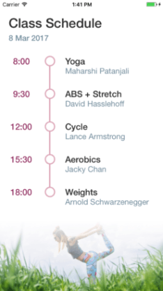 安卓页面
安卓页面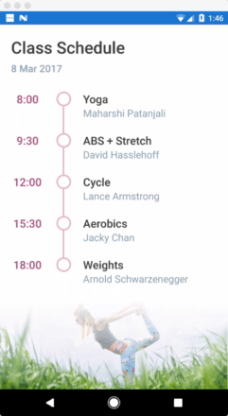
页面结构
Page Structure
这只是一个包含简单ListView的页面,没有什么比这更简单的了. 我把ListView的分割线(Separators)关闭了.然后设置一个令人感觉愉悦的行高(RowHeight)
This page is just a simple ListView, nothing really more complex than that. I turned the Separators off. Set the RowHeight to something that feels nice.
  <ListView
    x:Name="timelineListView"ItemTapped="timelineListView_ItemTapped"ItemsSource="{Binding .}"RowHeight="75"SeparatorVisibility="None">
你可能已经注意到,我设置了 一个操作简单的ItemTapped 事件.
Also, you may notice I have an ItemTapped hooked up that doesn’t do much:private void timelineListView_ItemTapped(objectsender, ItemTappedEventArgs e) { timelineListView.SelectedItem = null; }
这个事件是为了防止行(row)被选中,主要是因为一旦 某行(row)被选中,会让整个页面显得非常难看.当然了,是否禁止行(row)被选中,取决于你的布局,你可能正在做 主从页面(Master Detail Page)的导航布局。
It just disables a row from being selected, mainly becauseit looks rubbish when one of the rows is selected… but of course depending on your layout, you might actually want to do Master / Detail style navigation.
头部
Header
如果你想让一个东西出现在ListView的上面并随着 ListView的滚动而滚动,请使用一个设置了Header的ListView。
小贴士: 无论你在做什么,都不要把一个ScrollView 放在整个页面的最外层。使用一个嵌套的滚动容器(scrolling containers)只会让你欲哭无泪. (例如,在ListView的内部使用ScrollView,这是一个非常愚蠢的举动)。最好的做法是使用 Header。
对于我们的Header, 我们只使用一个非常简单的包含一些标签(Label)和一点点内边距(padding)的堆栈布局(StackLayout)
If you want something to appear above your ListView and have it scroll with the ListView use a header.
Pro Tip: Whatever you do, do NOT put a ScrollView around the entire page. Having nested scrolling containers (eg. ScrollView with ListView inside) is just going end with tears. Use a Header instead.
For our header, it’s just a simple stack layout with some labels and a bit of padding.
    <ListView.Header>
      <StackLayout Padding="20,40,0,30">
        <Label Style="{StaticResource PageHeaderLabel}"Text="Class Schedule" />
        <Label Style="{StaticResource SubHeaderLabel}"Text="8 Mar 2017" />
      </StackLayout>
    </ListView.Header>
页脚
Footer
我们放一张图片到整个列表的底部。没有什么特别的原因,只是为了让整个页面看起来更活泼一点,同时展示footers 是怎么工作的。你可以轻易移除掉这张图片,写一个更好的布局,我发现我只是为了完成 我的header/footer 想法........你们随意......
在我们的时间轴页面,页脚(footer)只包含一个只有两行一列的栅格布局(Grid)。背景图片“Footer.png” 占据了两行。然后我们需要一个 白色透明的渐变图片 覆盖在第一行. 创造出一个 有淡入效果的图片。
Down the bottom of the list, we have just put an image. Not for any particularly good reason, just to jazz up the page a bit and show how footers work. You could easily get rid of it and have a nice layout, I figured I’d just include it to complete the header / footer idea.
In our case the footer contains a Grid with two rows. The actual background image “Footer.png” occupies both the rows. Then we have a transparent-to-white gradient image that is overlaid in the first row. Basically just creating a fade in effect for the image.
    <ListView.Footer>
      <Grid RowSpacing="0">
        <Grid.RowDefinitions>
          <RowDefinition Height="64" />
          <RowDefinition Height="100" />
        </Grid.RowDefinitions>
        <Image Grid.RowSpan="2"Aspect="AspectFill"HorizontalOptions="Fill"VerticalOptions="Start"Source="YogaImage.png" />
        <Image Aspect="Fill"Grid.RowSpan="2"HorizontalOptions="Fill"Source="FadeToWhite.png" />
      </Grid>
    </ListView.Footer>
ViewCell(这个不知如何翻译,懂得自然懂....)
所有的 魔法 都发生在ViewCell,ViewCell定义了 每行(each row)是什么样子。
这个栅格布局包含3列两行,这就是全部了.
All the real magic happens in the ViewCell which defines what each row is going to look like.
At it’s core it’s just a simple Grid with 3 columns and two rows.
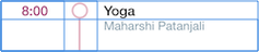
唯一有趣的部分是形成时间轴的直线和圆圈。ViewCell所需的高度是由一个非常薄且是垂直的BoxView所支撑的. 我们的圆形图片覆盖在第一行。所以,这里并没有什么魔法.......
The only really interesting bit of this is the actual lines and circles that form the timeline. This is achieved bya thin vertical BoxView that runs the height of the Viewcell. Overlayed in the first row is our circle image. Nothing magical here.
现在 你可能注意到,在是否可见(IsVisible)这个属性上使用了值转换器(ValueConverter),为什么要这样做呢,是为了不让最后一行的圆圈后面也出现直线。
我们的模型(Model)对象(在真实的app项目里会是ViewModel)有一个属性叫做 是不是最后一个(IsLast),这个属性在最后一行时会是真(true)。 然后我有一个NotBooleanConverter分配到行的IsVisible这个属性,所以这条直线在最后一行不会被渲染。 可能会有一点尴尬,但是这是此时我所能想到的最好的解决办法了.
Now you might notice that it uses a ValueConverter for the IsVisible property, this is kind of a hack to make the line not appear in the last row. Our model object (which would actually probably be a ViewModel in a real app) has a property called IsLast which is set to true for the last row. And then we have a NotBooleanConverter assigned to the IsVisible of the line, so basically the line isn’t rendered on the last row. It feels a bit awkward, but off the top of my head, given the time, I couldn’t think of a better option.
    <ListView.ItemTemplate>
      <DataTemplate>
        <ViewCell>
          <Grid ColumnSpacing="0"RowSpacing="0">
            <Grid.ColumnDefinitions>
              <ColumnDefinition Width="100" />
              <ColumnDefinition Width="30" />
              <ColumnDefinition Width="*" />
            </Grid.ColumnDefinitions>
            <Grid.RowDefinitions>
              <RowDefinition Height="Auto" />
              <RowDefinition Height="*" />
            </Grid.RowDefinitions>

            <Label HorizontalOptions="Center"Style="{StaticResource ClassTimeLabel}"Text="{Binding ClassTime, StringFormat='{0:H:mm}'}" />

            <Label
              Grid.Column="2"Margin="20,0"Style="{StaticResource ClassNameLabel}"Text="{Binding ClassName}" />

            <Label
              Grid.Row="1"Grid.Column="2"Margin="20,0"Style="{StaticResource ClassInstructorLabel}"Text="{Binding Instructor}" />

            <BoxView
              Grid.RowSpan="2"Grid.Column="1"BackgroundColor="{StaticResource TimelineColor}"HorizontalOptions="Center"IsVisible="{Binding IsLast, Converter={local:NotBooleanConverter}}"VerticalOptions="Fill"WidthRequest="3" />

            <Image Grid.Column="1"Source="Bullet.png" />

          </Grid>
        </ViewCell>
      </DataTemplate>
    </ListView.ItemTemplate>
总结:
一个简单的使用ListView的时间轴布局就这么被完成了。而且效果还不错。
下面是所用技术的链接
所以:如果你喜欢这篇文章,就请评论吧! 如果你有更有趣更好的布局,请让我知道,谢谢.